Selecting the perfect colors for your interior aesthetic painting project embarks on an exhilarating journey, enabling you to imbue your personal style into the canvas of your living spaces. It’s of paramount importance to contemplate how these colors mirror your distinctive preferences and craft the intended ambiance within each room.
The influence of colors on our emotions and perceptions is profound, endowing them with a formidable capability to reshape the atmosphere of any interior setting. Ranging from calming pastels to vibrant tones, each hue carries its own energy, capable of eliciting a diverse range of emotions. Through meticulous curation of your home’s color palette, you possess the ability to fabricate an environment harmonious with your vision, heightening the overall aesthetic of your abode.
The process of color selection for your walls transcends mere pigment selection; it’s an endeavor to forge an encounter that deeply resonates with you, every single time you step into a room.
Table of Contents
ToggleTesting Colors In Different Lighting Conditions
Selecting the perfect colors for your interior aesthetic painting endeavor holds immense significance in establishing the desired ambiance within your space. However, it’s crucial to bear in mind that colors can manifest differently based on the lighting situation. To ensure precise color choice, it’s imperative to assess how various colors appear during different times of day.
The Significance Of Appraising Color Appearances Under Varied Lighting
Lighting wields considerable influence over our perception of colors. Natural light, in particular, exerts a profound effect on how paint colors manifest across the day’s span. Colors might exude vibrancy and radiance under direct sunlight, yet appear subdued or lackluster in artificial illumination. By scrutinizing color reactions across different lighting contexts, you can make an enlightened decision about which tones harmonize best with your interior aesthetic.
The Impact Of Natural Light On Paint Color Displays Throughout The Day
Natural light is a dynamic entity, changing due to factors like sun positioning and cloud cover. This dynamic interplay significantly impacts how paint colors are interpreted. For instance, a warm yellow tone might emanate a cozy allure during daylight hours, only to adopt a cooler and less inviting demeanor as twilight descends. Acknowledging these natural light fluctuations becomes paramount while selecting paint colors for your space.
Guidelines For Testing Paint Samples Across Diverse Timeframes To Ensure Precision
To accurately gauge how paint colors will materialize under varying light circumstances, adhere to these beneficial guidelines:
1. Acquire Samples: Secure small paint samples from local home improvement stores or manufacturers directly.
2. Optimal Placements: Choose locations within your space that receive varying degrees of natural light during the day.
- Time Diversity: Apply sample paints in designated sections and observe them during distinct periods—morning, noon, afternoon, and evening.
- Temperature Nuances: Take note of any color shifts prompted by temperature-related lighting fluctuations—warmer or cooler.
- Post-Application Observations: After paint samples are applied, ensure complete drying and monitor their transformation over time.
- Holistic Assessment: Evaluate how the tested colors harmonize with existing furniture, flooring, and décor elements.
- Gather Opinions: Solicit input from family or friends on color impressions throughout the day.
By adhering to these measures, you’ll cultivate a deeper comprehension of how your chosen paint shades will perform under diverse lighting contexts. Armed with this insight, you can make a well-informed decision that resonates with your interior aesthetic aspirations.
Highlighting Consistency In Colors Through Furniture And Decor
Achieving a unified and visually captivating interior aesthetic heavily relies on the harmonious coordination of paint colors with your existing furniture and decor elements. The importance of maintaining consistent color schemes throughout your living spaces cannot be overstated, as it contributes to the creation of an inviting atmosphere that resonates with your personal style. Let’s delve into strategies that underscore the emphasis on consistent colors using furniture and decor.
The Importance Of Harmonizing Paint Colors
When embarking on an interior painting project, the significance of aligning chosen colors with the furniture and decor already in place must not be underestimated. A thoughtfully synchronized color palette elevates the overall ambiance of your environment, elevating its visual allure. By taking into account the tones inherent in your furniture—whether they lean towards warm neutrals or vibrant accents—you can opt for paint colors that complement and amplify their inherent beauty.
Crafting A Unified Aesthetic Through Complementary Color Schemes
One particularly effective approach to cultivating a sense of unity is the utilization of complementary color schemes. These schemes revolve around the selection of colors positioned on opposite ends of the color wheel, resulting in a harmonious contrast. For instance, if your living room boasts beige furniture, envision painting the walls with shades of blue or gray to cultivate an air of elegance and refinement.
To further propagate this sense of cohesiveness, extend this approach throughout various rooms. Suppose your dining room boasts warm neutral tones like brown or cream. In that case, it’s prudent to choose paint colors for adjoining spaces that harmonize with these hues. This not only facilitates a seamless transition between rooms but also preserves each space’s distinctiveness.
Infusing Visual Allure With Accent Colors
Incorporating accent colors offers a superb method of infusing visual intrigue into your environment sans overwhelming it. Contemplate the incorporation of accent walls or small decorative elements adorned in vivid hues that seamlessly integrate with the existing color palette. For instance, if your guest bedroom predominantly features white furniture, an accent wall bathed in a rich blue hue can imbue the room with dimension and charisma.
Apart from accent walls, leverage textiles and decorative items to propagate accent colors throughout the space. This encompasses throw pillows, curtains, rugs, or artworks boasting bursts of color. By strategically dispersing these elements across different rooms, you can curate a home that exudes coherence while effortlessly mirroring your individual style.
Exploring The Dynamic Interplay Of Established And Immovable Components
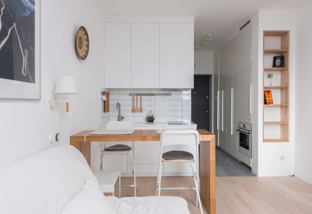
When embarking on an interior painting project to enhance your aesthetic, it’s paramount to factor in the established and immobile elements within your space. These enduring fixtures, such as flooring or cabinetry, wield substantial influence in shaping the overall ambiance of your room. By harmonizing your paint selections with these steadfast components, you can attain an equilibrium and seamless aesthetic transformation that will genuinely metamorphose your environment.
To commence, scrutinize the color palette of your preexisting elements. Take heed of the predominant hues inherent in your flooring, cabinetry, or any other unchanging attributes. This will serve as the genesis for opting for complementary or divergent paint colors. For example, if your wooden floors radiate warm tones, opting for earthy shades like beige or olive green for your walls can forge a harmonious and snug atmosphere.
Contrasting with existing elements can also serve as a potent statement, infusing your space with visual allure. Consider the scenario where you boast sleek white cabinets in your kitchen—opting for a profound navy blue on the walls can engender a striking juxtaposition that elevates the overarching aesthetic. Similarly, coupling vibrant red walls with stainless steel appliances in a contemporary bathroom can give rise to an arresting amalgamation.
Conversely, if a more subtle approach resonates, complementing existing elements can be equally impactful. Imagine neutral-hued tiles in your bathroom; selecting subdued pastel tones like lavender or seafoam green for the walls can amplify the serenity of the space while upholding an air of refinement.
To navigate this process adeptly, here are some pointers: Craft color swatches: Assemble paint samples you’re contemplating and position them adjacent to immobile elements to assess their interplay. Factor in lighting: Acknowledge that lighting conditions can influence how colors manifest within a room. Subject paint samples to diverse lighting scenarios to ensure their harmony with immobile elements. Seek wellsprings of inspiration: Delve into design publications, online platforms, or social media channels to garner ideas on effectively harmonizing colors with fixed components across assorted spaces. Enlist expert insight: If uncertainty concerning color combinations prevails or you crave professional counsel, ponder enlisting an interior designer or color specialist who can proficiently guide you through the journey.
By meticulously contemplating the established and immobile facets within your space, you can cherry-pick paint colors that heighten the overarching aesthetic, birthing a visually gratifying milieu. Whether opting to diverge from or echo these elements, striking the right equilibrium guarantees a stunning denouement that mirrors your style and sensibilities. Thus, unleash your ingenuity and embark on an endeavor to transfigure your space through the prism of perfect colors!
Enhancing Your Interior Aesthetic: Mastering Subtle Color Combinations
The impact of your interior aesthetic painting project hinges greatly on your color choices. A key factor to bear in mind is sidestepping color clashes that might divert attention from your intended style. With a handful of uncomplicated guidelines, you can forge harmonious color schemes that elevate your room’s ambiance.
When it comes to color selection, it’s pivotal to factor in undertones and complementary shades. Complementary colors, diametrically positioned on the color wheel, yield a dynamic visual impact when used together. Nevertheless, deploying them extensively or with conflicting undertones can yield an overwhelming and disconcerting appearance. For equilibrium, opt for a dominant hue and complement it with shades or tints of its complementary counterpart.
Neutral tones play a pivotal role in weaving together a coherent palette, all the while affording other design components the chance to dazzle. Employing neutral shades as a foundation provides a versatile backdrop for furniture, artwork, and embellishments to take the spotlight. Consider infusing neutrals like beige, cream, or light gray into your interior aesthetic painting endeavor.
Strategic integration of dark hues can imbue a room with depth and drama. Yet, embracing darker tones without minding their underlying tones can result in an imbalanced and somber atmosphere. Attending to warm undertones (red, yellow) or cool undertones (blue, green) when selecting shades like dark teal or deep gray is paramount. This guarantees a unified and visually satisfying overall aesthetic.
To further circumvent jarring color disparities, you can adopt an array of tactics, such as:
- Crafting Contrast With Lighter Tones: Pairing dark-hued walls with lighter furnishings or accents establishes contrast while upholding a sense of harmony in the space.
- Harnessing Accent Walls: Rather than saturating an entire room in a bold hue, contemplate applying it to an accent wall to attract attention sans overwhelming the area.
- Infusing Texture: Introducing textural elements to walls through methods like faux finishes or wallpaper can help temper the impact of vibrant colors, shaping a captivating visual focal point.
- Factoring In Lighting: Distinct light sources can influence how colors manifest in a room. Experiment with your chosen colors in diverse lighting conditions to confirm their desired effect.
- Drawing Inspiration From Nature: Nature presents an abundance of harmonious color pairings. Extract inspiration from landscapes or natural elements while devising your palette.
By adhering to these measures and taking into account undertones, complementary shades, and judicious application of neutrals and dark tones, you can avert discordant color clashes in your interior aesthetic painting venture. Remember, the objective is to craft a space that mirrors your taste while sustaining an aesthetically pleasing environment.
Achieving Color Harmony: A Guide To Selecting The Perfect Palette
Embarking on an interior aesthetic painting project holds both excitement and challenge as you navigate the world of colors. Amid the plethora of paint shades available, the task at hand involves a process of refinement to curate a palette that aligns seamlessly with your inclinations, desired ambiance, and practicality. Here are seven sequential steps to effectively steer you toward the ideal colors for your endeavor.
1. Reflect On Personal Tastes: Commence the journey by delving into your personal preferences. Ponder over the hues that stir feelings of joy, tranquility, or vitality within you. Are you magnetized by the serenity of cool blues and greens, or do the warmth of reds and yellows beckon you? This introspection will pave the way for the selection of a primary or key color for each space.
2. Craft The Desired Atmosphere: Envision the emotional tapestry you wish to weave within each room. Distinct colors elicit varied emotions and moods. While cooler shades often instill a sense of calm, warmer tones envelop spaces in a snug and inviting embrace. Contemplate the intended ambiance of each room and harmonize your paint choices accordingly.
3. Gauge Practical Utility: The functionality of each room plays a pivotal role in the color decision-making process. A home office or study area might benefit from hues that simultaneously soothe and stimulate, nurturing concentration and efficiency. Conversely, bedrooms might thrive with tranquil tones that foster rejuvenating slumber.
4. Harness Digital Resources Or Expert Insight: To visualize potential color combinations before making a commitment, leverage digital tools or seek guidance from professionals like interior designers and color consultants. These resources offer tailored advice, and many platforms provide virtual paint visualizers where you can experiment with various hues using photographs of your space.
5. Holistic Deliberations: Prior to settling on your color choices, additional factors warrant contemplation:
- Durability: Opt for paints that withstand the rigors of daily use.
- Maintenance Ease: Consider whether your chosen shades can be effortlessly cleaned and upheld over time.
- Long-Term Appeal: Ponder whether the selected palette will retain its charm or risk becoming outdated as time passes.
6. Dive Into Color Schemes: Venture into the realm of color schemes to unearth the perfect fusion for your space. Introduce accent colors to infuse visual intrigue and establish focal points. Draw inspiration from magazines, digital platforms, or the natural world. The color wheel and principles of color theory serve as guiding lights as you explore diverse combinations.
7. Experiment With Paint Samples: As you whittle down your options, the time arrives to test paint samples. Acquire small paint cans or gather swatches from your local home improvement store. Apply these samples to your walls and observe how they interact with varying lighting conditions throughout the day. This phase empowers you to make a confident choice grounded in the appearance of colors within your specific space.
Embracing these seven steps equips you to judiciously handpick the right colors for your interior aesthetic painting venture. Keep personal inclinations, desired ambiance, and practicality at the forefront. Rely on digital tools and professional insights to visualize your concepts, while accounting for durability, maintenance ease, and long-term satisfaction. Through methodical exploration of color schemes, you’ll weave together a breathtaking wall palette that elevates your home’s overall aesthetic.
Conclusion: Successfully Choosing The Right Colors For Your Project
Well done! You’ve successfully navigated the crucial phases of selecting the ideal color palette for your interior aesthetic painting venture. Through the strategic exploration of colors across various daylight conditions, prioritizing harmony with your furnishings and embellishments, taking into account the existing design components, and sidestepping any potential clashes, you’re excellently positioned to attain a truly remarkable outcome.
With these fundamental principles now firmly in place, the time has come to unfetter your artistic ingenuity and actualize your creative vision. Keep in mind that the realm of color selection doesn’t adhere to rigid regulations. So, grasp those paintbrushes with eagerness, set the ambiance with melodies that kindle your inspiration, and permit your imagination to soar unrestricted.
As you immerse yourself in this transformative process, remain open to unanticipated avenues and novel combinations. Allow the hues you’ve meticulously chosen to breathe life into your surroundings, evoking emotions and refining the ambiance in ways that are uniquely yours. This is your opportunity to fashion an environment that reverberates with your individuality and panache.
In this journey of aesthetic expression, relish the freedom to experiment, refine, and even push boundaries if your creative intuition beckons you to do so. As you stand at the intersection of imagination and reality, remember that your choices are integral to the tapestry of your space’s narrative.
As the final strokes of paint grace your walls, revel in the realization that you’ve not only embarked on an interior design project but also embarked on a voyage of self-discovery through the language of color. So, embrace this transformative juncture with zest, and witness your living space evolve into a testament of your artistic journey.
Sources:
Do You Need A Professional House Painting Team You Can Trust?
Refresh your home and space with the experts at PaintMasters! Since 1994, PaintMasters has been the top residential and commercial painting company in Concord, California. We proudly serve Lamorinda, Tri-Valley, Contra Costa, and the surrounding areas. With our cutting-edge technology, unparalleled expertise, and state-of-the-art 15,000 CFM spray booth, you can be sure that your cabinets will receive a top-notch finish. Our team of experienced professionals is expert in painting interior and exterior custom homes plus decks, acoustic removal, drywall repair, and texturing – so you can trust that it’s done right the first time.
We also specialize in staining for interior or exterior walls, cabinets, doors, decks, and other woodwork for both homes and commercial projects such as office spaces and restaurants. Whether you need to refresh a tired old room or give a new room an individual touch of style – PaintMasters is here to help. We are dedicated to delivering a flawless finish on every project with our unique blend of design instinct and technical skills certified by our professional results.
Don’t wait – let PaintMasters show you what a difference a quality paint job can make! Call us now or request an estimate online – we look forward to helping you transform your space! Contact us today to get started!