Paintmaster logo

BLog

Interior Aesthetic Painting

Top 10 Color Combinations For Interior Aesthetic Painting In California

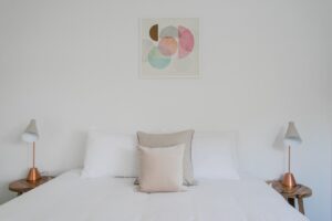
Are you on the hunt for the ultimate color combinations to elevate the enchantment of your home’s interior? The transformative power of choosing the right colors knows no bounds, capable of turning your living space into a realm of wonder. Whether you’re yearning for a snug, inviting warmth or aiming for a dash of contemporary verve, the ideal fusion of colors holds the key to an extraordinary metamorphosis. From the serenity of tranquil neutrals to the audacity of striking and expressive hues, consider us your creative accomplices! In the radiant realm of California, a symphony of coastal allure, urban allure, and untamed beauty harmoniously converge. It’s little surprise that Californian homeowners are driven to mirror this kaleidoscope of inspiration within their abodes. Envisage, as we meticulously present an array of handpicked color ensembles, infusing your dwelling with that unmistakable Californian charisma becomes effortless. Unveil the secrets of how these ingenious color marriages can breathe an exhilarating new vitality into the very fabric of your living spaces. Prepare to embark on a journey of revelation as we delve into the art of discovering the quintessential palette for your upcoming interior aesthetic masterpiece. Your canvas awaits; let’s plunge into the realm of possibilities and unveil the perfect color symphony for your artistic endeavor! 2023’s Hottest Interior Paint Colors Setting California Homes Ablaze! Keeping up with the latest trends is crucial, and in 2023, Californian homeowners are drawn to specific paint colors that effortlessly elevate their living spaces. By acquainting yourself with these favored interior paint colors, you can ignite your creativity and impart a contemporary touch to your abode. Californians have an inherent knack for aesthetics, and this year is no different. Let’s delve into the most coveted paint colors that are currently dominating the interior design landscape in the Golden State. 1. Tranquil Seaside Green Among Californians, tranquil seaside green has gained substantial acclaim. This rejuvenating hue introduces a sense of serenity to any room, making it particularly fitting for bedrooms or home offices where relaxation and concentration take precedence. 2. Inviting Rustic Terracotta Embracing earth-inspired tones has become a prevailing trend, and inviting rustic terracotta embodies this movement. This opulent, reddish-brown shade imparts warmth and dimension to living rooms or dining areas, crafting an inviting ambiance for gatherings with loved ones. 3. Enduring Indigo Blue Indigo blue maintains its cherished status among homeowners seeking a blend of timeless and contemporary charm. Its versatility makes it a suitable choice as an accent wall or as the dominant hue in more expansive spaces such as living rooms or kitchens. 4. Delicate Blush Rose For those who favor a softer visual appeal, delicate blush rose has emerged as a favored selection in numerous Californian residences. This gentle shade adds a touch of femininity without overpowering the overarching design, making it an excellent choice for bedrooms or nurseries. 5. Refined Slate Gray The ascent of refined slate gray is owed to its ability to cultivate an upscale and sophisticated atmosphere. Whether adorning walls or furnishings, this versatile color harmonizes seamlessly with various design styles, spanning from modern to traditional. 6. Lively Sunflower Yellow Injecting a burst of color into your living space can instantaneously elevate its mood. Lively sunflower yellow proves to be a splendid option for accent walls or furniture pieces, infusing vivacious and spirited vibes into living rooms or home offices. 7. Crisp Ivory Though it may exude simplicity, crisp ivory endures as a timeless and favored choice for interior painting. Its knack for conjuring a clean and invigorating aesthetic renders it fitting for any room in the domicile, offering a blank canvas that permits other elements to shine. 8. Organic Olive Harmony Californians increasingly gravitate toward organic tones that establish a connection with nature, and olive harmony is emblematic of this trend. This soothing shade introduces an organic sensibility to spaces like bathrooms or kitchens, fostering a tranquil ambiance reminiscent of outdoor vistas. 9. Expressive Plum Enigma For those inclined to make a daring proclamation, the expressive plum enigma presents a beguiling option. This profound hue imparts depth and theatricality to bedrooms or dining areas, particularly when deployed strategically as an accent wall or infused through accessories. 10. Serene Misty Blue-Gray Serene misty blue-gray has garnered recognition as homeowners seek soothing hues that nurture relaxation and mindfulness. This adaptable color performs admirably in bedrooms or living rooms, fashioning a serene setting ideally suited for unwinding at the day’s end. Discover The Finest Color Combinations For Enhancing Interior Aesthetics In California Immerse yourself in an exclusive compilation of the finest color pairings meticulously tailored to the essence of Californian interiors. Unearth distinct and visually captivating color amalgamations that will set your residence apart. Delve into a myriad of choices to unearth the flawless blend that resonates with your individualistic flair. Californian interiors boast a vibrant and eclectic design sensibility. From charming coastal abodes to contemporary urban lofts, the extensive array of domiciles in California presents boundless prospects. Whether your aspiration is to craft a tranquil sanctuary or to manifest a daring proclamation, presented below are the supreme 10 color combinations that possess the potential to metamorphose your environment: 1. Coastal Tranquility: Embrace the serenity of California’s coastlines through a palette influenced by sandy beaches and maritime hues. Merge gentle beige walls with accents of seafoam green, sky blue, and coral for an invigorating and breezy ambiance. 2. Desert Mirage: Seize the essence of California’s desert panoramas by fusing warm earthy tones with splashes of vivacious hues. Opt for terracotta walls complemented by cactus green, dusty pink, and mustard yellow accents. 3. Urban Elegance: For those who seek a sleek and contemporary demeanor, opt for an urban-chic color scheme. Select cool grays as your foundation, punctuated by hints of metallic silver or gold, alongside profound navy or burgundy highlights for a multi-dimensional effect. 4. Bohemian Enchantment: Infuse your space with bohemian allure, employing opulent jewel tones harmonized with organic textures. Adorn your walls with shades of deep purple or teal and accessorize

Read More »
Interior Aesthetic Painting

Interior Aesthetic Painting VS. Traditional: Which Is Right For You?

Embark on a captivating journey of design dilemmas! Are you grappling with the enchanting conundrum of choosing between the spellbinding allure of interior aesthetic painting and the timeless embrace of traditional design for your abode? Brace yourself, for this decision holds the key to an awe-inspiring transformation of your living space, where every brushstroke of modern aesthetics and each intricately carved detail of tradition play a symphony of elegance. Step into a world where choices resonate with the heartbeat of your soul. Imagine the clash of contemporary charisma and classic opulence, each beckoning you to craft an ambiance that mirrors your essence. But amidst this exhilarating panorama, a question arises: How do you untangle the threads of your preferences and dreams? Fear not, for we shall embark on an expedition through the labyrinth of choice. Delve into the very core of your being – your taste, your rhythm of life, and the air you wish to breathe within your haven. Traverse with us, as we explore the kaleidoscope of possibilities that lie within the realms of your residence. Picture the vivid strokes of art-inspired modern aesthetics adorning your walls, conversing with your spirit. Envision the intricate tapestry of ornate coastal charm, whispering tales of the sea and sun-kissed shores. If you’re ready to transmute your dwelling into a masterpiece but find yourself caught in the crossroads of design destiny, take heed! This narrative is your guiding star, illuminating the path to a resplendent realm where interior aesthetic painting and traditional design waltz in harmony. Let this odyssey be your compass, steering you towards a space that not only echoes with beauty but narrates the saga of you. So, dear adventurer of style read on! Your quest for a living space that encapsulates your essence is about to unfold in breathtaking chapters. Exploring The Distinctive Traits Of Traditional Interior Design The Traditional Interior Design Style is renowned for its accentuation of grace, equilibrium, and meticulous embellishments. It embodies an ageless aesthetic that radiates elegance and allure. Below are key attributes that define the traditional interior design: Elegance As Priority: Foremost in traditional interiors is the pursuit of elegance. The objective is to craft an ambiance of magnificence and luxury through meticulously chosen elements. From furnishings to accessories, each piece is handpicked to contribute a touch of sophistication. Symmetry And Equilibrium: Symmetry holds a pivotal role in traditional interior design. The spatial arrangement often adheres to a symmetrical blueprint, engendering a sense of equilibrium and concord. This symmetry echoes in the placement of furniture, artworks, and other adornments. Opulent Color Palette: Traditional interiors embrace opulent hues to foster an inviting atmosphere. Deep tones like burgundy, navy blue, and forest green frequently grace walls or are introduced through upholstery and drapes. These colors infuse warmth and profundity into the space. Elaborate Furnishings: Ornate furnishings stand as the cornerstone of traditional design. Intricate carvings, embellishments, and sumptuous fabrics collectively contribute to the overall aesthetic allure. Consider the timeless allure of wingback chairs, tufted sofas, and intricately detailed wooden tables. Intricate Patterns: Traditional interiors frequently showcase intricate patterns in textiles and wallpapers. Be it damask, floral motifs, or toile prints, these patterns add visual allure while upholding an air of refinement. Structured Arrangements: Formal layouts are a defining aspect of traditional interior design. Rooms typically adhere to clear focal points and demarcated zones for specific functions such as dining or relaxation. This imparts an organized flow within the space. Timeless Architectural Elements: Classic architectural features like crown molding, wainscoting, and coffered ceilings frequently find their place in traditional interiors. These elements contribute depth and visual interest to the room, heightening its overall appeal. Antique Or Vintage Artifacts: The traditional approach warmly welcomes the inclusion of antique or vintage pieces to evoke a sense of history and nostalgia. From ancestral furniture handed down through generations to thoughtfully curated embellishments, these items infuse a distinctive allure into the space. Artistry And Meticulousness: Traditional interior design celebrates artistry and meticulous attention to detail. Every facet, from furniture craftsmanship to fabric selection, is approached with precision. This emphasis on quality ensures that traditional interiors endure the test of time. The Traditional Interior Design Style harmoniously merges elegance, refinement, and enduring charm. Through the integration of rich hues, ornate furnishings, intricate patterns, and timeless architectural elements, it crafts spaces that emanate warmth and refinement. If you hold a reverence for artistry and are drawn to a more formal aesthetic, traditional interior design may resonate as the ideal choice. Comparing Classic And Traditional Design: Similarities And Distinctions Discovering Parallels And Disparities Between Classic And Traditional Design Approaches Both classic and traditional design styles emanate an aura of sophistication and timelessness, endowing them with enduring popularity in the realm of interior aesthetics. These two styles share numerous inherent characteristics that contribute to their timeless allure. For example, both styles embrace an essence of elegance and refinement, thereby fashioning spaces that radiate a grand and distinguished ambiance. Whether one opts for the classic or traditional design, the resultant interior possesses an ageless charm that transcends the transient nature of trends. Delving Into The Divergence Between The Classic And Traditional Approaches: Minimalism Versus Ornate Detailing The classic design inclination leans towards simplicity, favoring clean lines, unadorned furniture, and a focus on utilitarianism. This design ethos champions understated elegance through the use of muted color palettes and modest yet tasteful furnishings. Conversely, the traditional design ethos revels in opulence, characterized by intricate patterns, opulent textures, vivid hues, and intricate embellishments like moldings and carvings. The traditional design ethos creates an ambiance of luxury and lavishness that captures the very essence of splendor. Unveiling the Intersection of Historical Influences and Their Divergent Expressions The classic design draws inspiration from diverse historical epochs, skillfully reinterpreting them through a contemporary lens. It draws cues from periods such as Greek and Roman architecture while seamlessly infusing modern elements, culminating in a harmonious amalgamation of past and present. In contrast, traditional design hews more closely to specific eras like

Read More »
Interior Aesthetic Painting

The Dos And Don’ts Of Interior Aesthetic Painting: Tips For Success

Imagine embarking on a journey that turns your living space into a captivating sanctuary, where aesthetics dance in every corner. If you’re a newcomer to this enchanting realm, be prepared to be dazzled. Welcome to a guide that promises to unfurl the secrets to triumph in your artistic pursuit of interior painting. Behold the transformative power that lies in the art of choosing colors and wielding them with mastery. Each stroke of pigment has the potential to orchestrate a symphony of visual delight within your abode. Delve into the art of selecting hues that resonate with your soul, and master the techniques that breathe life into your walls. Whether it’s the finesse of edging with precision or gracefully concealing baseboards, consider us your artistic mentors. Yet, remember, the canvas’s allure is amplified by the preparation that precedes it. Explore the arcane rituals of priming surfaces, a ritual that lays the foundation for the grandeur to come. Learn the delicate dance of filling imperfections and the gentle caress of sandpaper, transforming roughness into a satin embrace. In this grand overture, we also illuminate the pitfalls to sidestep, ensuring your journey is free of mishaps and frustrations, and brimming with the elegance of a seasoned artist’s touch. So, with roller in hand and canvas protected, let’s embark on a voyage through the enchanting realm of interior aesthetic painting. Unveil the commandments that lead to mastery and avoid the pitfalls that ensnare the uninitiated. Let this be your initiation into a world where walls breathe stories and colors whisper symphonies. The odyssey begins now! Foundational Principles Of Interior Design: Crafting Captivating Spaces Unlocking the secrets to masterful interior design principles is akin to holding the key to crafting visually captivating spaces. Prepare to embark on a journey where color, texture, and lighting play enchanting symphonies, while the dance of furniture placement and room layout choreographs a harmonious tale. Balance: Orchestrating Equilibrium The essence of balance is profound. It orchestrates a symphony of equilibrium, guiding the eye with seamless grace. Within this realm, three balanced archetypes reign supreme: Symmetrical balance is a grand reflection where elements mirror along an imaginary axis, exuding tradition and formality. Asymmetrical balance is a carefree dance of distinct elements, each bearing equal visual weight, ushering in a relaxed, informal elegance. Radial balance is the cosmic arrangement where focal points ignite a spiral of harmonious objects. Proportion: Sculpting Scale And Harmony Proportion, the art of scale, is your sculptor’s chisel. It harmonizes elements within a realm, both in their individual grandeur and in their embrace. When curating your interior canvas: Gauge the size of larger pieces, ensuring they embrace, not engulf, the space. Let dainty ornaments adorn substantial pieces, a delicate interplay of companionship. Celestial heights guide your choice of luminous fixtures and artistic revelations. Color, Texture, And Lighting: Conjuring Emotion Color, a painter’s palette of emotion, infuses spaces with life. It evokes moods and narrates tales, a symphony of hues resonating in harmony: Warm tones—ruby, saffron, gold—embolden spaces with intimacy and warmth. Cool shades—azure, jade—imbue tranquility, the gentle hush of a calm sea. Neutrals—ivory, slate, taupe—embrace all styles, a serene backdrop for creativity’s dance. Texture, A Weaver Of Stories, Adds Layers To Your Narrative: Rough textures intertwine with smooth ones, creating tales of contrast. Soft fabrics converse with rugged materials, birthing dimensions anew. Lighting, the maestro, conducts ambiance with its myriad notes. Attend to both sunlit dawns and artificial constellations: Ambient light—the sun at noon—bathes all in a gentle embrace. Task lights illuminate quests, turning desks into theatres of productivity. Accent lights bestow celestial crowns upon art and architectural gems. Furniture Placement And Room Layout: Choreographing Unity Furniture, like characters on a stage, defines space and story. Its placement shapes flow and resonance, welcoming guests to a carefully curated performance: Bow to the focal point, let furnishings sing in chorus around it. Spaces to breathe—a waltz of comfort—between each entity. Traffic’s artful flow informs the placement, where movement is a ballet. The Essential Dos And Don’ts Of Interior Aesthetic Painting The canvas of your home holds endless possibilities, waiting to be painted with the strokes of creativity and the hues of your imagination. The world of interior aesthetic painting is a realm where walls become the storytellers, colors transform emotions, and textures evoke sensations. To embark on this artistic journey with finesse and confidence, it’s crucial to understand the guiding principles that can make or break your masterpiece. In this article, we delve into the dos and don’ts of interior aesthetic painting, illuminating the path to creating captivating and harmonious spaces. The Do’s: Crafting Brilliance 1. Choose High-Quality Paints: The foundation of any artistic endeavor rests upon the quality of your tools. Opt for high-quality paints from reputable brands. These paints not only offer a wide spectrum of colors but also provide better coverage and durability, ensuring that your masterpiece stands the test of time. 2. Preparation Is Key: Before the first stroke of color graces the surface, meticulous preparation is essential. Clean your walls to remove dust and grime, ensuring a smooth canvas. Repair imperfections like cracks and holes using spackle or drywall compound. A well-prepared surface guarantees that your paint adheres flawlessly, resulting in a visually pleasing finish. 3. Primer, The Silent Ally: The unsung hero of the painting world, primer is a must in certain situations. It creates an even base coat, enhances paint adhesion, and intensifies color vibrancy. Apply primer when transitioning between dark and light colors, or when painting on bare wood or new drywall installations. 4. Harmony Of Color, Texture, And Lighting: The trio of color, texture, and lighting is the symphony that sets the mood. Choose colors that resonate with the ambiance you wish to create – warm tones for coziness, cool hues for tranquility, and neutrals for versatility. Introduce textures that add depth – soft fabrics juxtaposed with rugged surfaces. Lighting, both natural and artificial, is the conductor of ambiance – embrace its variations to orchestrate an enchanting aura. The

Read More »
Interior Aesthetic Painting

7 Steps In Choosing The Right Colors For Your Interior Aesthetic Painting Project

Selecting the perfect colors for your interior aesthetic painting project embarks on an exhilarating journey, enabling you to imbue your personal style into the canvas of your living spaces. It’s of paramount importance to contemplate how these colors mirror your distinctive preferences and craft the intended ambiance within each room. The influence of colors on our emotions and perceptions is profound, endowing them with a formidable capability to reshape the atmosphere of any interior setting. Ranging from calming pastels to vibrant tones, each hue carries its own energy, capable of eliciting a diverse range of emotions. Through meticulous curation of your home’s color palette, you possess the ability to fabricate an environment harmonious with your vision, heightening the overall aesthetic of your abode. The process of color selection for your walls transcends mere pigment selection; it’s an endeavor to forge an encounter that deeply resonates with you, every single time you step into a room. Testing Colors In Different Lighting Conditions Selecting the perfect colors for your interior aesthetic painting endeavor holds immense significance in establishing the desired ambiance within your space. However, it’s crucial to bear in mind that colors can manifest differently based on the lighting situation. To ensure precise color choice, it’s imperative to assess how various colors appear during different times of day. The Significance Of Appraising Color Appearances Under Varied Lighting Lighting wields considerable influence over our perception of colors. Natural light, in particular, exerts a profound effect on how paint colors manifest across the day’s span. Colors might exude vibrancy and radiance under direct sunlight, yet appear subdued or lackluster in artificial illumination. By scrutinizing color reactions across different lighting contexts, you can make an enlightened decision about which tones harmonize best with your interior aesthetic. The Impact Of Natural Light On Paint Color Displays Throughout The Day Natural light is a dynamic entity, changing due to factors like sun positioning and cloud cover. This dynamic interplay significantly impacts how paint colors are interpreted. For instance, a warm yellow tone might emanate a cozy allure during daylight hours, only to adopt a cooler and less inviting demeanor as twilight descends. Acknowledging these natural light fluctuations becomes paramount while selecting paint colors for your space. Guidelines For Testing Paint Samples Across Diverse Timeframes To Ensure Precision To accurately gauge how paint colors will materialize under varying light circumstances, adhere to these beneficial guidelines: 1. Acquire Samples: Secure small paint samples from local home improvement stores or manufacturers directly. 2. Optimal Placements: Choose locations within your space that receive varying degrees of natural light during the day. Time Diversity: Apply sample paints in designated sections and observe them during distinct periods—morning, noon, afternoon, and evening. Temperature Nuances: Take note of any color shifts prompted by temperature-related lighting fluctuations—warmer or cooler. Post-Application Observations: After paint samples are applied, ensure complete drying and monitor their transformation over time. Holistic Assessment: Evaluate how the tested colors harmonize with existing furniture, flooring, and décor elements. Gather Opinions: Solicit input from family or friends on color impressions throughout the day.   By adhering to these measures, you’ll cultivate a deeper comprehension of how your chosen paint shades will perform under diverse lighting contexts. Armed with this insight, you can make a well-informed decision that resonates with your interior aesthetic aspirations.   Highlighting Consistency In Colors Through Furniture And Decor Achieving a unified and visually captivating interior aesthetic heavily relies on the harmonious coordination of paint colors with your existing furniture and decor elements. The importance of maintaining consistent color schemes throughout your living spaces cannot be overstated, as it contributes to the creation of an inviting atmosphere that resonates with your personal style. Let’s delve into strategies that underscore the emphasis on consistent colors using furniture and decor. The Importance Of Harmonizing Paint Colors When embarking on an interior painting project, the significance of aligning chosen colors with the furniture and decor already in place must not be underestimated. A thoughtfully synchronized color palette elevates the overall ambiance of your environment, elevating its visual allure. By taking into account the tones inherent in your furniture—whether they lean towards warm neutrals or vibrant accents—you can opt for paint colors that complement and amplify their inherent beauty. Crafting A Unified Aesthetic Through Complementary Color Schemes One particularly effective approach to cultivating a sense of unity is the utilization of complementary color schemes. These schemes revolve around the selection of colors positioned on opposite ends of the color wheel, resulting in a harmonious contrast. For instance, if your living room boasts beige furniture, envision painting the walls with shades of blue or gray to cultivate an air of elegance and refinement. To further propagate this sense of cohesiveness, extend this approach throughout various rooms. Suppose your dining room boasts warm neutral tones like brown or cream. In that case, it’s prudent to choose paint colors for adjoining spaces that harmonize with these hues. This not only facilitates a seamless transition between rooms but also preserves each space’s distinctiveness. Infusing Visual Allure With Accent Colors Incorporating accent colors offers a superb method of infusing visual intrigue into your environment sans overwhelming it. Contemplate the incorporation of accent walls or small decorative elements adorned in vivid hues that seamlessly integrate with the existing color palette. For instance, if your guest bedroom predominantly features white furniture, an accent wall bathed in a rich blue hue can imbue the room with dimension and charisma. Apart from accent walls, leverage textiles and decorative items to propagate accent colors throughout the space. This encompasses throw pillows, curtains, rugs, or artworks boasting bursts of color. By strategically dispersing these elements across different rooms, you can curate a home that exudes coherence while effortlessly mirroring your individual style. Exploring The Dynamic Interplay Of Established And Immovable Components When embarking on an interior painting project to enhance your aesthetic, it’s paramount to factor in the established and immobile elements within your space. These enduring fixtures, such as flooring or cabinetry, wield substantial

Read More »
Interior Aesthetic Painting

Unlocking The Power Of Colors: Interior Aesthetic Painting Explained

The potency of colors is profound. Have you ever contemplated the remarkable ability of the right blend of shades to entirely metamorphose a room’s ambiance and emotional tone? The realm of interior aesthetic painting has emerged to unlock colors’ authentic potential and enhance the visual allure of your dwelling. By tapping into the psychology of colors, interior aesthetic painting escorts your living spaces through an exhilarating odyssey across a spectrum of lively hues. It extends beyond mere color infusion; it involves crafting an encounter that harmonizes with your individuality and panache. From calming pastels that conjure a tranquil milieu to daring tones that assert a presence, this artistic methodology amplifies the finest attributes in each nook of your habitation. Thus, if you stand prepared to commence a thrilling voyage where colors assume a central role, fasten your seatbelt and prepare to delve into the marvels of interior aesthetic painting. Let us plunge into this captivating domain where colors wield the authority to transmute any dwelling into an enchanting domicile. Examining The Psychology Of Color In Interior Design The impact of colors on our emotions and their capacity to shape distinct atmospheres within a given area is truly remarkable. In the realm of interior design, a deep comprehension of color psychology stands as a vital key to unlocking the potential of hues and constructing a visually appealing environment. Let’s delve into the profound influence that diverse colors wield over our moods and overall encounters. Individual colors evoke a wide spectrum of emotions and exert psychological influences on people. Each hue possesses its own distinctive character, capable of eliciting precise emotional reactions. Take, for example, warm colors like red and orange, which often engender a welcoming and spirited ambiance. These tones are frequently linked with ardor, zeal, and warmth. They prove particularly suitable for spaces designed for social interaction or high-energy engagements, such as living rooms or play areas. Conversely, cool colors like blue and green encourage serenity and repose. These shades are renowned for their calming attributes, contributing to tranquil atmospheres in bedrooms or meditation corners. Blue is frequently correlated with serenity and trust, while green symbolizes harmony and the natural world. Neutral shades, such as beige and gray, bring forth a sense of equilibrium and refinement. These adaptable colors serve as splendid backdrops, allowing other elements within the space to shine. Beige imparts warmth without overwhelming the surroundings, whereas gray introduces elegance while maintaining a neutral disposition. Many interior designers gravitate towards neutral tones when crafting office spaces or zones demanding focused attention. The Color Wheel: Primary Colors, Secondary Colors, And Beyond To gain a comprehensive grasp of how colors interact, referring to the color wheel proves invaluable—a tool harnessed by designers to fathom color relationships. Primary colors—red, blue, and yellow—constitute the fundamental building blocks from which all other colors stem. Blending these primary hues begets secondary colors such as purple (blue + red), green (blue + yellow), and orange (red + yellow). Each amalgamation yields its own distinct shade, accompanied by its unique psychological influences. Researchers have ascertained that particular colors wield the ability to impact our cognitive faculties and conduct. For instance, blue has been observed to heighten productivity, rendering it a fitting choice for office spaces or study areas. On the other hand, yellow stimulates creativity and is frequently employed in art studios or classrooms to kindle students’ inspiration. The Potency Of Color In Metamorphosing A Room’s Ambiance By judiciously integrating various colors into your interior design concept, you hold the power to profoundly transfigure a room’s aura and appearance. Grasping the psychological sway of colors stands as a pivotal element.  Here are several means by which color can be employed: Accent walls: Coating one wall with a striking color can establish a central point of interest, infusing visual allure into a space. Vivid furniture: Introducing dynamic furniture pieces can inject character into a room, harmonizing with the overall color palette. Ornaments and textiles: Encompassing colorful ornaments like throw pillows, rugs, or drapes can infuse dashes of color without inundating the area. Play with textures: Distinct materials reflect light in varied ways, influencing how colors manifest within a room. Experimenting with glossy surfaces versus matte finishes can reshape the perception of color within a space. Exploring The Emotional Resonance Of Abstract Art The realm of abstract art offers a captivating avenue for artistic expression, wielding the potency of colors, shapes, and forms to convey sentiments devoid of recognizable objects. This distinctive mode empowers artists to craft visual symphonies that elicit precise emotions and atmospheres in their audience. By delving into the emotional reverberations of abstract art, we unveil a realm of aesthetic possibilities that enrich the canvas of interior design. Abstract art frequently boasts audacious and vibrant colors as its hallmark. These chromatic spectrums possess the ability to awaken profound sentiments within us. Consider, for instance, the fiery reds and fervent oranges that can kindle excitement or rouse passion. When employed judiciously in the realm of interior design, these vivid hues infuse spaces with vigor, birthing an ambiance teeming with vitality. In contrast, the gentle pastel shades gracing abstract masterpieces exert a soothing influence on our psyche. Serene blues, tender pinks, and tranquil greens orchestrate an aura of calmness and placidity within a room. The incorporation of these hues into the interior aesthetic through abstract art can serve to nurture an environment that fosters repose and tranquility. The versatility inherent in abstract art stands as one of its most remarkable attributes. Each beholder arrives with their own distinct experiences and viewpoints, facilitating a personalized connection with the artwork. This very trait renders abstract art an impeccable selection across diverse interior styles, seamlessly adapting to assorted themes and concepts. For instance: In the realm of minimalist interiors: Abstract art featuring clean lines and geometric configurations can harmonize with the austerity and streamlined elegance emblematic of minimalist design. In spaces inspired by bohemian flair: Abstract paintings characterized by bold brushwork and dynamic color palettes can elevate the eclectic

Read More »
Commercial Painter

Cost Vs. Value: Why Commercial Painting Is A Worthy Investment For Walnut Creek Businesses

Are you a business owner in Walnut Creek looking to make a lasting impression on your customers? Wondering how to enhance the overall appearance and professionalism of your establishment? Look no further than commercial painting. Investing in professional painting services can have a significant impact on your business’s success. In today’s competitive market, first impressions matter more than ever. A fresh coat of paint can instantly transform the look and feel of your business, creating a positive initial experience for customers and clients. It not only boosts your brand image but also adds credibility to your enterprise within the community. Studies show that customers are more likely to trust businesses with an appealing aesthetic. By investing in commercial painting, you increase customer trust and foster loyalty, leading to higher chances of repeat business. It has been found that businesses that prioritize their appearance witness a significant increase in customer retention rates. Don’t underestimate the power of commercial painting. Join countless successful entrepreneurs in Walnut Creek who have made this worthy investment for their businesses’ long-term growth and prosperity. Benefits Of Commercial Painting For Walnut Creek Businesses Extends The Lifespan Of Commercial Properties By Protecting Them From Damage Commercial properties in Walnut Creek are subject to various environmental factors that can cause wear and tear over time. Harsh sunlight, rain, wind, and even pollution can all contribute to the deterioration of buildings. However, investing in commercial painting can help extend the lifespan of these properties by providing a protective barrier against these elements. A fresh coat of paint acts as a shield, preventing moisture from seeping into the walls and causing mold or rot. It also helps protect against corrosion and rust on metal surfaces. By regularly maintaining and repainting their buildings, businesses in Walnut Creek can avoid costly repairs and replacements in the long run. Provides A Fresh And Updated Look To Outdated Or Worn-Out Buildings First impressions matter, especially. If your business premises appear outdated or worn out, it may give potential clients the wrong impression about your brand. Commercial painting offers an opportunity to revitalize your building’s exterior or interior appearance. With a new color scheme or a modern design, you can transform your business property into an eye-catching space that reflects your brand identity. Whether it’s a retail store, office building, or restaurant in Walnut Creek, a fresh coat of paint can breathe new life into any space and make it more inviting to customers. Allows Businesses To Stand Out Among Competitors In Walnut Creek In a competitive market like Walnut Creek, businesses need every advantage they can get to stand out from their rivals. Commercial painting is one effective way to differentiate yourself from competitors who may neglect their property’s aesthetics. By choosing unique colors or incorporating bold designs into your building’s exterior or interior spaces, you create a visual interest that attracts attention. This distinction not only helps increase foot traffic but also builds brand recognition among residents and visitors in Walnut Creek. Enhances Employee Morale And Productivity With A Visually Appealing Work Environment A visually appealing work environment can have a significant impact on employee morale and productivity. When employees are surrounded by a well-maintained and aesthetically pleasing space, it can boost their mood and motivation. Commercial painting allows you to create an inspiring atmosphere for your employees in Walnut Creek. By using colors that promote focus, creativity, or relaxation, you can tailor the paint job to suit the specific needs of your business. A vibrant and visually stimulating workplace can foster a positive work culture and contribute to higher levels of productivity among your team. Impact On Property Value And Aesthetics Investing in commercial painting for Walnut Creek businesses can have a significant impact on both property value and aesthetics. By enhancing the appearance of commercial properties, this investment proves to be a wise choice with long-term benefits. Increases Property Value, Making It An Investment With Long-Term Benefits When considering a new property or evaluating rental properties, potential buyers and tenants often prioritize the overall quality and appearance of the building. A fresh coat of paint can instantly transform a dull exterior into an eye-catching sight, increasing its market value. According to real estate experts, properties that undergo aesthetic upgrades tend to sell or lease at higher prices compared to those that lack such improvements. Attracts Potential Buyers Or Tenants Due To Improved Aesthetics The first impression is crucial. The appearance of a commercial property plays a pivotal role in creating an inviting atmosphere that captures attention. With a well-executed commercial painting project, businesses in Walnut Creek can significantly enhance their curb appeal. This improved visual appeal not only draws more foot traffic but also entices prospective buyers and tenants who are looking for visually appealing spaces. Improves Curb Appeal, Attracting More Foot Traffic To Businesses In Walnut Creek A vibrant and well-maintained exterior has the power to make any business stand out from the competition. Commercial painting allows businesses in Walnut Creek to revitalize their buildings’ exteriors, making them more attractive and memorable. When passersby notice an aesthetically pleasing storefront or office building, they are more likely to be curious about what lies inside. This increased foot traffic can lead to higher customer engagement and ultimately result in greater profitability for businesses. Makes Properties More Marketable, Leading To Faster Sales Or Leases In today’s competitive real estate market, speed is often essential. Commercial painting offers an effective solution to make properties more marketable. By improving the appearance of a building, potential buyers or tenants are more likely to be enticed by its aesthetic appeal. This increased interest can lead to faster sales or leases, reducing the time and effort required to find suitable occupants for commercial spaces in Walnut Creek. https://www.youtube.com/watch?v=3CkikCtp_IY Cost VS. Value Analysis For Walnut Creek Businesses Commercial painting is often overlooked as a worthy investment by Walnut Creek businesses. However, when considering the cost versus value, it becomes clear that commercial painting offers an array of benefits that

Read More »
Commercial Painter

Everything You Need To Know About The Commercial Painting Process

Are you curious about what goes into a commercial painting project? Look no further! We’ve got everything you need to know about the commercial painting process right here. From large-scale buildings to industrial structures, commercial painting requires specialized knowledge and skills to ensure a top-notch finish. It’s not just about slapping some paint on the walls – it’s an art form that involves careful surface preparation, priming, and applying multiple coats of paint. But it’s not all about aesthetics. Safety is paramount in every painting job. Professional commercial painters follow strict protocols to protect themselves and others while working on these massive projects. From pressure washing to palette selection, every step matters in achieving a flawless result. So whether you’re a construction contractor or simply curious about how things get painted on such a grand scale, buckle up as we dive into the world of commercial painting. Get ready for insider tips, industry secrets, and fascinating facts that will make you appreciate the skill and craftsmanship behind every stroke of paint. Let’s roll up our sleeves and uncover the magic behind commercial painting projects together! Importance Of Commercial Building Preparation For Interior And Exterior Painting Proper preparation is essential. Whether you are planning to paint the interior walls or give a fresh look to the exterior of your commercial property, taking the time to prepare the surfaces beforehand can make a significant difference in the final result. Better Adhesion And Long-Lasting Finish One of the primary reasons why surface preparation is vital in commercial painting is that it ensures better adhesion of paint to surfaces. Without proper cleaning, repairing, and priming, the paint may not adhere well to the walls or other surfaces, leading to premature peeling or flaking. By thoroughly preparing the surfaces before applying paint, you create an optimal foundation for long-lasting results. Identifying Underlying Issues Surface preparation also helps identify any underlying issues that need to be addressed before painting. During this process, professionals thoroughly inspect the commercial building’s interiors and exteriors for any signs of damage or deterioration. It could be cracked walls, water damage, mold growth, or structural issues that require attention. By addressing these problems early on, you can prevent further damage and ensure a healthier environment within your commercial property. Enhanced Appearance And Durability Taking the time to prepare surfaces before painting significantly improves their overall appearance and durability. Proper cleaning removes dirt, grime, and stains from both interior walls and exterior facades. Necessary repairs such as filling cracks or fixing damaged floors ensure a smooth finish after painting. Priming prepares the surface by creating a uniform base coat that enhances color vibrancy while protecting against moisture penetration. Healthier Commercial Spaces Commercial buildings often have unique needs. Surface preparation plays a crucial role in ensuring cleanliness and reducing potential health hazards within these spaces. Thorough cleaning removes allergens, dust, and other pollutants that may have accumulated over time. By addressing any underlying issues such as mold growth or water damage, you can create a healthier and safer environment for employees, customers, or tenants. Types Of Painting Jobs And Scraping Techniques Different types of commercial painting jobs require various scraping techniques to ensure a smooth and long-lasting finish. Whether it is new construction, maintenance painting, or renovations, understanding the different scraping methods is essential for achieving professional results. Scraping techniques play a crucial role in preparing surfaces by removing loose paint or coatings. This process is necessary to create a clean canvas for further treatment or the application of new paint layers. Let’s explore some common scraping techniques used in commercial painting: Hand Scraping Hand scraping involves manually removing loose paint using handheld tools such as scrapers, wire brushes, or sandpaper. It requires skill and precision to scrape away old paint without damaging the underlying surface. Hand scraping is often preferred when dealing with delicate areas or intricate designs where power tools may not be suitable. Power Sanding Power sanding utilizes electric sanders equipped with abrasive pads to remove old paint quickly and efficiently. This method is particularly effective when dealing with large surface areas or rough textures that require more aggressive scraping. Power sanders come in different sizes and strengths, allowing painters to adapt their approach based on the specific requirements of each project. Proper scraping prepares surfaces for subsequent treatments like caulking or priming before applying fresh coats of paint. By removing loose particles and creating a smooth base, these techniques ensure better adhesion and durability of the final finish. When choosing between hand scraping and power sanding, factors such as surface condition, area size, and time constraints should be considered. For instance, hand scraping may be preferable for smaller projects where attention to detail is crucial, while power sanding can save time on larger-scale jobs. In addition to the scraping techniques mentioned above, caulking plays an important role in commercial painting projects. Caulk is a flexible material used to seal gaps between surfaces such as walls, windows, or doors. It helps prevent air leakage, water intrusion and improves the overall appearance of the painted surface. Before applying caulk, it is essential to scrape away any loose paint or debris from the area to ensure proper adhesion. Once the surface is clean and smooth, caulking can be applied using a caulking gun. The caulk should be carefully placed along gaps or joints and smoothed out for a seamless finish. Common Coats And Paints Used In Commercial Painting Services Understanding the different types of coats and paints used is essential. From primer coats to topcoats, each layer serves a specific purpose in enhancing the durability and aesthetic appeal of the painted surfaces. Let’s delve into the common coats and paints utilized by professional commercial painters. Primer Coats: Enhancing Adhesion And Uniformity Primer coats play a crucial role in preparing surfaces for paint application. They are applied before the topcoat to enhance adhesion, ensuring that the paint adheres effectively to various surfaces such as cement plasters or gypsum plasters. By creating a uniform

Read More »
Commercial Painter

Commercial Painting Trends To Watch In Walnut Creek: The 2023 Edition

Looking to revamp your business with a fresh coat of paint? Get ready to be amazed by the latest commercial painting trends taking Walnut Creek by storm in 2023. Stay ahead of the competition as we delve into what’s new and exciting in the world of commercial painting for businesses right here in Walnut Creek. From vibrant color palettes that exude energy to innovative techniques that create eye-catching textures, we’ve got you covered. Discover how these trends can transform your space into a captivating oasis that draws customers in like bees to honey. So, if you’re ready to make a bold statement and leave a lasting impression, let’s dive into the fascinating world of commercial painting trends in Walnut Creek. Get inspired by the possibilities that await as we explore the cutting-edge techniques and design choices that are reshaping businesses across this vibrant city. Don’t miss out on this opportunity to elevate your brand and create an unforgettable experience for your customers. It’s time to embrace the future of commercial painting in Walnut Creek! Building Commercial Colormix Palettes: Step-By-Step Process Creating captivating color mix palettes for commercial spaces is an art that can transform the ambiance and appeal of any business environment. In this guide, we will take you through a step-by-step process to master the art of building visually appealing color mix palettes specifically designed for commercial settings. 1. Understand the Space: Before diving into the world of colors, it’s essential to understand the space you are working with. Consider factors such as the size of the room, natural lighting, architectural elements, and existing color schemes. This understanding will help you make informed decisions when selecting colors for your palette. 2. Define Your Objective: Every commercial space has a purpose and target audience. Whether it’s a restaurant, office, or retail store, identifying your objective is crucial in creating an effective color mix palette. Are you aiming for a calming atmosphere or an energetic vibe? Keep your objective in mind throughout the process. 3. Research Color Psychology: Colors have psychological effects on people’s moods and emotions. Take some time to research color psychology and understand how different hues can impact individuals in various ways. For example, blue promotes calmness and productivity, while yellow stimulates creativity and positivity. 4. Choose a Dominant Color: Start by selecting a dominant color that aligns with your objective and complements the brand identity if applicable. This color will be prominent throughout the space and set the overall tone for your color mix palette. 5. Create Harmonious Combinations: Once you have your dominant color chosen, it’s time to build harmonious combinations around it. Look for complementary or analogous colors that enhance their visual impact while maintaining balance within the space. 6. Consider Contrast: Incorporating contrasting colors can add depth and interest to your color mix palette. Experiment with shades that create visual contrast against each other without clashing. This can be achieved by selecting colors from opposite ends of the color wheel or using lighter and darker variations of your dominant color. 7. Test Samples: Before committing to a final color mix palette, it’s crucial to test samples in the actual space. Lighting conditions and surrounding elements can significantly impact how colors appear. Paint small sections or use swatches to see how the colors interact with each other and the environment. 8. Iterate and Refine: Building an exceptional color mix palette is often an iterative process. Don’t be afraid to experiment, refine, and make adjustments as you go along. Trust your instincts but also seek feedback from clients or colleagues to ensure you are creating a visually appealing and cohesive palette. By following this step-by-step process, you can effortlessly develop stunning color mix palettes that enhance any business environment. Remember, there are no strict rules. So why wait? Dive into the world of commercial painting trends and unleash your creativity in Walnut Creek’s 2023 edition! Exploring Commercial Segment And Corresponding Colormix Palettes The 2023 edition brings exciting opportunities for businesses to create impactful spaces that reflect their brand identity. By understanding how various sectors influence unique color choices, businesses can transform their spaces into visually captivating environments. 1. Dive Into Different Segments Within The Commercial Industry The commercial market encompasses a wide range of sectors, each with its distinct characteristics and requirements. By tailoring the color palette to suit a specific sector, businesses can enhance the overall ambiance and appeal of their space. Let’s take a closer look at some key segments and their corresponding color mix palettes: Hospitality Sector: Warm earth tones combined with soothing blues evoke a sense of relaxation and comfort. Rich jewel tones like deep purples and emerald greens add a touch of luxury. Accent colors such as metallic gold or silver create an elegant atmosphere. Retail Sector: Vibrant and energetic colors like bold reds or bright yellows attract attention and stimulate customer engagement. Neutral backgrounds with pops of contrasting hues highlight product displays. Pastel shades convey a sense of sophistication for high-end boutiques. Healthcare Sector: Soft pastels in calming shades promote healing and tranquility. Light greens are associated with nature, promoting a sense of well-being. Accents in warm oranges or yellows create a welcoming environment. 2. Understanding How Specific Business Segments Impact Color Selection In addition to considering individual sectors, it is crucial to understand how specific business types influence color selection within those sectors. For example: Restaurants: Colors that stimulate appetite such as reds or oranges are often used in dining areas, while calming blues and greens may be chosen for waiting areas or lounges. Offices: Neutral tones like grays or whites are commonly used to create a professional and focused atmosphere. Accent colors can be added to reflect the company’s branding. Spas: Soft, muted colors such as pastel pinks or lavenders promote relaxation and serenity, enhancing the overall spa experience. By aligning color choices with the nature of the business, companies can create spaces that resonate with their target audience and enhance their brand image. 3. The Impact

Read More »
Commercial Painter

Calculating ROI: How Commercial Painting Pays Off For Concord Businesses

Did you know that a simple coat of paint can skyrocket your property’s value? As we enter the year 2023, the impact of commercial painting on property value has gained significant recognition. Concord businesses are awakening to the financial benefits that investing in commercial painting can bring. With growing awareness, there is an increasing demand for professional painting services to enhance property worth. Strategic commercial painting is expected to drive up property values this year. In today’s competitive market, staying ahead means maximizing your property’s potential. By embracing the power of commercial painting, businesses in Concord are poised to reap substantial rewards. So why wait? Let’s delve into how this underrated investment can transform your property’s value and make it stand out from the rest. Get ready to unlock the untapped potential of your business with a fresh coat of paint! Ways Painting Enhances Commercial Property Value A fresh coat of paint on a commercial property can work wonders in enhancing its overall value. Not only does it improve curb appeal, but it also has the power to attract potential tenants or buyers. Let’s explore how painting can transform a commercial space and why it pays off for Concord businesses. Improving Curb Appeal And Attracting Potential Tenants Or Buyers The exterior appearance of a building is crucial in creating a positive first impression. A well-maintained paint job instantly catches the eye and signals that the property is cared for. By investing in professional painting services, business owners can revitalize their commercial spaces and make them more appealing to potential tenants or buyers. Furthermore, a fresh coat of paint allows businesses to update their property’s aesthetic, ensuring it remains contemporary and visually attractive. This modern touch increases the chances of attracting high-quality tenants who value aesthetics and want to align their brand with an appealing environment. Protecting Buildings From Weather Damage Beyond aesthetics, high-quality paint serves as a protective shield against weather damage. Concord’s climate can be unforgiving at times, with rain, snow, and harsh sunlight taking their toll on buildings over time. However, by applying durable paint specifically designed for exterior surfaces, property owners can safeguard their investment. Weather-resistant paints act as a barrier against moisture infiltration, preventing structural issues such as rot or mold growth. They also shield surfaces from UV rays that can cause fading or discoloration over time. By reducing weather-related damage through regular repainting cycles, businesses save significantly on maintenance costs in the long run. Creating A Professional And Inviting Atmosphere Color selection plays a vital role in creating an atmosphere that resonates with customers or employees. The right color palette sets the tone for professionalism while also fostering an inviting environment within commercial spaces. For example: Neutral tones like beige or light gray convey sophistication and elegance, making them suitable for corporate settings. Bright and vibrant colors like yellow or orange can inject energy into retail spaces, attracting customers and encouraging impulse purchases. Soft blues or greens promote a calming effect, ideal for healthcare facilities or office spaces where focus and productivity are essential. By carefully choosing the right colors for different areas of a commercial property, business owners can create an atmosphere that aligns with their brand values and enhances the overall experience for customers and employees alike. Increasing Perceived Value With Well-Maintained Paintwork Well-maintained paintwork speaks volumes about the care taken in maintaining a commercial property. It gives potential tenants or buyers the confidence that they are investing in a space that is not only visually appealing but also well-managed. The perception of value is crucial. A building with peeling paint or faded surfaces may be perceived as neglected or poorly managed, leading to lower interest from prospective tenants or buyers. On the other hand, a property with fresh paint exudes an air of professionalism and attention to detail, increasing its perceived value in the eyes of potential stakeholders. Increasing Property Value Through Commercial Painting Strategic planning and execution of commercial painting projects can significantly increase property value.The appearance of the building plays a crucial role in attracting tenants and customers. A fresh coat of paint can transform a worn-out exterior into an inviting space that leaves a lasting impression. Professional painters are well-versed in the art of enhancing property value through their expertise. They utilize techniques that ensure long-lasting results, preserving the integrity of the building’s structure. By using high-quality paint and proper application methods, they create a durable finish that withstands harsh weather conditions and everyday wear and tear. Attention to detail during surface preparation is another key aspect of increasing property value through commercial painting. Professional painters meticulously clean and prepare surfaces before applying new paint. This meticulousness guarantees a flawless finish, free from any imperfections or blemishes. The result is an aesthetically pleasing appearance that enhances the overall appeal of the property. Regular maintenance and touch-ups also play a vital role in maintaining property value over time. A reputable commercial painting company understands the importance of ongoing care for painted surfaces. They offer maintenance programs that include routine inspections and touch-ups as needed. By addressing minor issues promptly, such as peeling or fading paint, they prevent larger problems from arising down the line. Professional painters know how to transform them with quality paint choices. The right color palette can create an atmosphere that aligns with a business’s brand identity or target market. Whether it’s vibrant hues for a lively restaurant or calming tones for an office space, professional painters have the expertise to bring these visions to life. Exterior painting is equally important. A well-maintained exterior not only enhances curb appeal but also protects against damage caused by weather elements such as rain, sun exposure, and temperature fluctuations. Professional painters use specialized paints and coatings that provide durability and resistance to these environmental factors, ensuring the longevity of the commercial building. https://www.youtube.com/watch?v=P8SW5LOLCig How Painting Boosts Property Value: Insights And Examples Studies have consistently shown that well-executed commercial painting projects can have a significant impact on the selling prices

Read More »
Commercial Painter

The A To Z Of The Commercial Painting Process: Everything You Should Know

Are you ready to transform your commercial space from drab to fab? Look no further! The A to Z of the commercial painting process is here to guide you every step of the way. Industrial painting services offer more than just a fresh coat of paint; they bring life and vibrancy into your business environment. Hiring professional commercial painters ensures top-notch results that leave a lasting impression on clients and employees alike. Before diving into this colorful world, it’s crucial to consider key factors that will make your project a success. From selecting the perfect palette of paints to finding a skilled painter, each decision plays a vital role in achieving your desired outcome. So, let’s embark on this creative journey together and uncover the secrets behind an exceptional commercial painting process. Get ready to add a splash of color that truly reflects your brand’s personality! Understanding The Commercial Painting Process Commercial painting involves various techniques, surface preparation, and factors that contribute to the durability and longevity of the paint job. Let’s delve into each aspect to gain a comprehensive understanding of the commercial painting process. Different Types Of Commercial Painting Techniques Commercial painters employ different techniques based on the requirements of a project. Here are some commonly used methods: 1. Brush And Roller: This traditional technique involves using brushes and rollers to apply paint manually. It offers precise control over the application and is suitable for smaller areas or intricate details. 2. Spray Painting: In this technique, paint is applied using a spray gun, ensuring even coverage on large surfaces quickly. It is ideal for industrial settings or projects with extensive surface areas. 3. Powder Coating: Powder coating involves applying dry powder onto a surface electrostatically and then curing it under heat. This technique provides durable finishes and is commonly used in industries like automotive manufacturing. Importance Of Surface Preparation For A Successful Paint Job Surface preparation plays a crucial role in achieving a successful commercial paint job. Properly preparing surfaces ensures better adhesion, enhances durability, and prevents premature peeling or cracking. Consider these essential steps: 1. Cleaning: Thoroughly clean surfaces to remove dirt, grease, or any contaminants that could affect adhesion. 2. Repairing: Address any existing damages such as cracks or holes by filling them with appropriate materials like putty or spackle. 3. Sanding: Smoothen uneven surfaces by sanding them down to create an even base for the paint to adhere to. 4. Priming: Apply primer before painting to improve adhesion, seal porous surfaces, and enhance color vibrancy. 5. Masking: Protect adjacent areas from unwanted paint splatters by carefully masking them off with tape or plastic sheeting. Factors that affect the durability and longevity of commercial paint Several factors influence the durability and longevity of commercial paint. Understanding these factors is essential for achieving long-lasting results: 1. Quality of Paint: Using high-quality paints specifically formulated for commercial applications ensures better resistance to wear, fading, and weathering. 2. Surface Preparation: As mentioned earlier, proper surface preparation is crucial for ensuring good adhesion and long-lasting results. 3. Environmental Conditions: Extreme temperatures, humidity levels, exposure to UV rays, or corrosive substances can impact the lifespan of commercial paint. Selecting paints designed to withstand these conditions is vital. 4. Maintenance: Regular cleaning and maintenance help preserve the integrity of the painted surfaces and extend their lifespan. By comprehending different painting techniques, recognizing the significance of thorough surface preparation, and considering the various factors that affect durability, you are now equipped with a comprehensive understanding of the commercial painting process. Remember, whether you need precise brushwork or efficient spray application, ensuring proper surface preparation and selecting suitable paints are key to achieving a successful commercial paint job that stands the test of time. Preparing For A Successful Commercial Painting Project Proper preparation is the key to achieving a high-quality paint job that meets your expectations. Before diving into the actual painting phase, there are several essential steps you need to take to ensure a successful outcome. Assessing The Scope And Requirements Of The Project Before embarking on any commercial painting endeavor, it is crucial to assess the scope and requirements of the project. This involves evaluating factors such as the size of the commercial building, its current condition, and any specific challenges that may arise during the painting process. By conducting a thorough assessment, you can identify potential issues beforehand and plan accordingly. During this phase, it is also important to consider whether you require interior or exterior painting services. While both types involve their unique considerations, exterior painting often requires additional attention due to exposure to external elements such as weather conditions. Understanding these distinctions will help you determine what type of preparation is necessary for your specific project. Creating A Detailed Timeline And Budget Plan Once you have assessed the scope and requirements of your commercial painting project, it’s time to create a detailed timeline and budget plan. Having a well-defined schedule ensures that all tasks are completed in an organized manner, minimizing disruptions to your business operations. Consider breaking down your timeline into different phases such as preparation, priming, painting application, and drying time. Assigning realistic deadlines for each phase allows for better coordination with your chosen commercial painters and ensures that everything progresses smoothly. Simultaneously, developing a comprehensive budget plan is essential for managing costs effectively. Consider factors such as labor expenses, materials required (including quality paint), equipment rentals if necessary, and any additional services provided by the painting company. Having a clear understanding of your financial constraints will enable you to make informed decisions throughout the project. Communicating With Stakeholders And Setting Expectations Effective communication is vital for a successful commercial painting project. Engage in open dialogue with all relevant stakeholders, including building owners, tenants, property managers, and the painting company you have hired. Communicate your expectations regarding timelines, color choices, and any specific requirements. By setting realistic expectations from the outset, you can avoid misunderstandings or disappointments later on. Ensure that everyone involved understands the scope

Read More »